Yellow Slump
It has been a rough few weeks at my house with traveling spouse, sick kids, and then sick me. My writing/riding time got a little hit and then my motivation was totally destroyed by a stomach thing. I even stooped to reaching out to Hernando for motivation… and while i’m not going with his suggestion, when in doubt make fun of Lance, i got this idea seconds after he responded so I give him credit. It’s in a hippie energy thing… no other way of explaining it.
 So I kind of want to write something about Sea Otter, in fact, I totally want to go down there, but they did not respond to my one request about media credentials (don’t laugh, there are way freakier bloggers out there that get press credentials than us – we we get traffic), but I’ve been hedging since I have to work, well….at least show up, and i’m a-feared I’ll have to pay $20 for parking. I was about to look up results when i saw picture of Kristen Armstrong in a Sea Otter stage race yellow jersey. Holy crap it’s ugly. I mean it’s like Nebraska Century Club ugly.
I just realized this is going to be long and rambling. Guess it’s good you are all at stage races and shit.
I suppose I understand why US stage races all feel compelled to use yellow as their race leader jersey color but it doesn’t keep me from feeling a little annoyed. I have one yellow jersey, which I inevitably wear in July, meaning that everybody i see on the Spectrum, Valley Ride, or morning ride makes fun of me. Why am i mocked? Because yellow is the color of Le Tour. It’s their jersey color. They own it. They should trade mark it so somebody like Sea Otter doesn’t go and create a hot mess, which is my favorite Project Runway expression, that they then slap on riders who I like to see do well.
What’s wrong with that sucker? Where to start…. First, they have font problems. It’s three different font treatments stuck in a black blob. The variable font gives me a vague sense of neon. What they hell is that! A vague sense of neon? Can’t they just pick a freaking font and stick with it? I don’t think it even matches anything they have on their website or logo. I really don’t think they could have come up with that lettering unless they gave one line each to three different designers, and then had a fourth designer go and then put it in a frame under pain of death not to modify the thickness or color. Or they had a city college design student work on it. Now i feel like i’m hurting somebody’s feelings, but you should be told. The font isn’t working.
Second – Where the hell is the cute little otter that they put on shirts and stuff. The only thing that Sea Otter really has going for it is they can use a cute little otter in an Olympic mascot type of way. I see no reason they don’t get that otter on the jersey. In fact, why not make the color brown like a sea otter’s fur. I now it’s not an obvious choice and maybe it wouldn’t stand out enough but it would be better than using yellow which panders to the notion that the only thing American’s understand is a winner wears a yellow jersey.
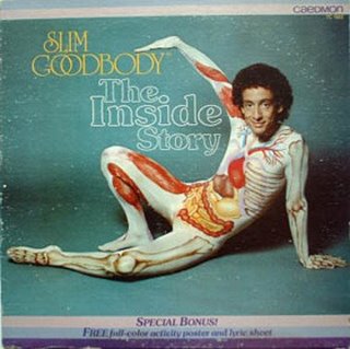
 Third – they have that crazy tiger strip stuff going on the front. That tiger stripr stuff has “Cipo fashion miss” all over it. It’s not as bad as the Slim Good Body suit he wore one year, which literally almost made me throw up, but it’s kind of tacky. Now the tiger stuff probably wouldn’t be too bad, if it wasn’t for the crazy neon like font that is all over the front but the two together equals hot mess. Oh, and to cap it all off, they forgot to leave room for team logo iron on so you have to cram that poor little monkey at the bottom of the jersey. Which of course reminds me of a joke… “A sea otter and a monkey walk in to a bar…”
I’ll let Sea Otter off the hook for a second to rant about this pathological need to put race leaders in yellow jerseys. We get it, the leader of the Le Tour wears yellow and since that’s a race that many American’s can relate too I understand why you stick a leader in yellow. However… the more memorable races, which look to unseat the ASO from their pre-eminent spot at the top of the world stage racing scene have their own trademark colors. The Giro has the pink jersey, and after a few years experimenting with the color “gold” the Veulta has settled on red, which does have a Spanish vibe to it given their flag, bull fighting, and FC Barcelona.
 What do American stage races do? TOC, Mt Hood, Cascade, NVGP, San Dimas, Merco, all use some version of the yellow jersey. It makes sense but is really pretty boring and does nothing to help their events stand out. Now that I think about it… Sea Otter just didn’t go far enough. They needed to go full Cipo. They need a “Zebra” jersey or something that can brand their race and make the leader identifiable for fan’s that can’t easily identify a disgraced former Euro-Star (Mancebo), random Australian (Ben Day), or American that should famous like Kristen Armstrong. (No Dad! She is not Lance’s Sister)
The lesson here? Yellow is safe, but Zebra stripes are forever. Definitely time to get Tim Gunn into the picture to figure out a jersey design for a race. I vote for rhinestones. Everything looks better when it sparkles.
April 15th, 2011 at
Sea Otter parking is free, the wrist band costs $12 for the day. It’s still not the event it used to be, it’s over bloated had souless.
April 15th, 2011 at
I was offended by the end of the second paragraph: “Nebraska Century Club ugly”, hey, I resemble that statement.
April 15th, 2011 at
I always assumed Aqua Sapone rode so hard was to get the race over with so they could get out of those kits faster. Bonus for hurling your bidon at an moto-official while wearing one.
April 15th, 2011 at
Maybe the jersey sucks because road cycling is still a second-tier discipline (as the prize money clearly demonstrates)?
April 16th, 2011 at
Fc Barcelona is red? Stick to cycling
Cycling fashion is silly to begging with. Anorexic “athletes” on tights and males that shave their legs are some other things that are more disturbing than a silly jersey. Don’t forget the skin suit and how bad some fatty criterium racers look in them sporting the famous racing muffin top
Let’s race on baggy shorts like real men.
In soccer, the players wear tights UNDER their baggy shorts
April 18th, 2011 at
OK – I’ll grant yellow is overused, and didn’t even notice the fonts really. I thought the logo had two, not three, but I’m not the artistic type. And when I saw two fonts, I assumed it was in an effort to emphasize the “CLASSIC” part of the name so that they can overcharge the public.
But I agree that it would be nice to use the Sea Otter cartoon on the Jersey and to leave room for a team logo to be added (maybe glued on?).
What are the opinions on doing Sea Otter as a Stage Race? Would other categories, like the M1/2/3 groups or the Cat 3s, like to have their Own Stage Race? Should the Pros add a 5th stage on one of the days?
April 19th, 2011 at
I think if Sea Otter were a timed stage race for other categories they’d get more riders. I love the courses and the support (SRAM follow vehicles for each field, plenty of neutral water & sport drink) & it’s too bad that many of the fields are so small.